Start with where the poster will be seen
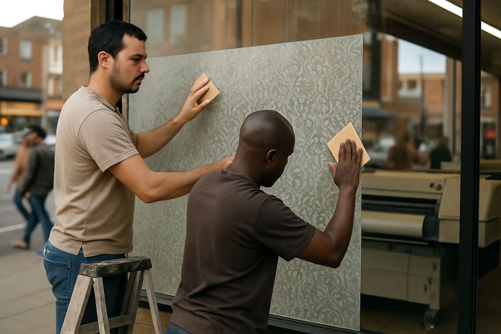
The first question is simple: how far away will people be when they read it? A poster in a shop window on Main Reef Road needs a different size from one inside a reception area or at a school hall in Randfontein. If people are walking past quickly, go larger. If they will stand close and read slowly, a smaller format can still work well.
As a rule, the greater the viewing distance, the fewer words you should use and the bigger the poster should be. A poster meant for a corridor noticeboard can carry more detail than one fixed high on a wall. If your message must be read from across a room, size and spacing matter as much as the words themselves.
- Close view: A4 or A3 for notices, price lists and short promotions
- Mid range view: A2 for retail specials and service announcements
- Longer range view: A1 or larger for windows, events and street-facing displays
Let the message length guide the format
Many people choose a poster size first and only then try to fit in the wording, logos and contact details. It usually works better the other way round. If your promotion has a headline, a short offer, one image and a contact detail, you can keep the layout clean in A3 or A2. If you need a full list of dates, prices, terms and multiple product lines, you may need more space or a different format altogether.
Do not force too much text into a small poster. When copy gets cramped, the poster becomes hard to scan and the main offer gets lost. One strong message will always work harder than a crowded sheet of information. In practical terms, poster size should support the message not fight it.
- Short message: special offer, event title or service notice
- Medium message: headline, visual, 2 to 4 support lines and contact details
- Long message: use a larger size or split the content into two posters
Match the poster to the wall space you have
Before you send artwork for printing, measure the actual wall or window area. It sounds basic, but many print jobs come in with no allowance for frames, power sockets, light switches or existing signage. In Randfontein CBD, shopfronts often have narrow window sections and mixed wall surfaces, so a size that looks good on screen may sit awkwardly on site.
Leave breathing room around the edges. A poster should not look jammed into a corner or cut off by a frame. For temporary promotions, think about where staff will place the poster and whether it must be changed often. If you have a municipal noticeboard, a reception wall or a retail window, the same design may need resizing for each space.
- Measure width and height in millimetres before choosing the format
- Check for obstructions such as handles, plugs, frames and grills
- Allow space for mounting tape, clips or a border if needed
A West Rand example: one promotion, three poster sizes
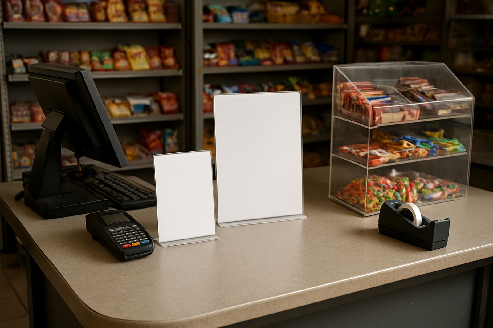
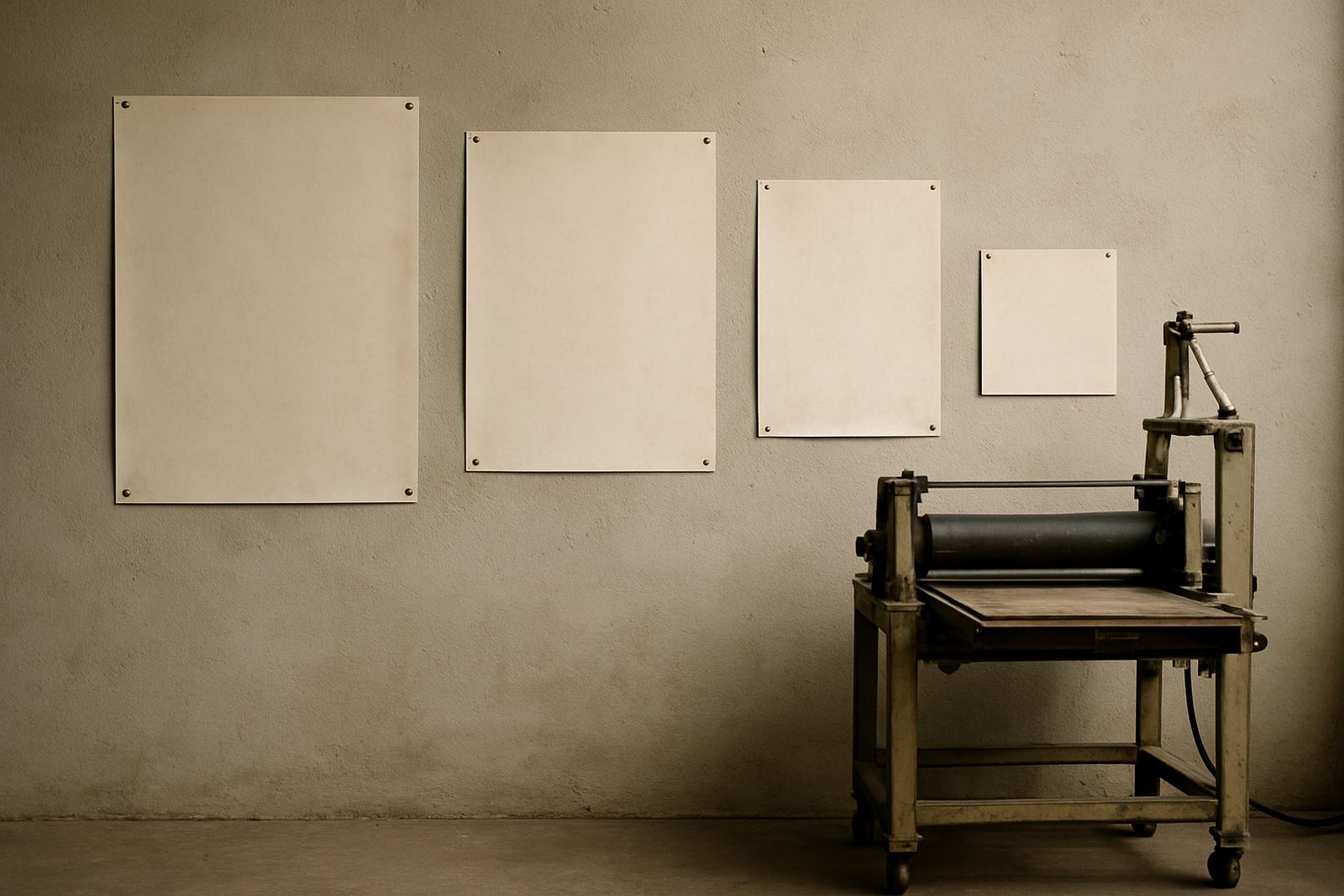
Take a local hardware or service business running a weekend special across Krugersdorp, Westonaria and Roodepoort. The same promotion may need three versions. An A4 version can sit near the till for walk-in customers, an A2 version can go in the window, and a larger A1 version can face the street or parking area. The wording can stay similar, but the layout changes with distance and wall space.
This is where quick turnaround digital printing helps. When a manager needs same day changes because prices moved or stock changed, the poster can be adjusted quickly without losing clarity. A good print shop will also check whether the artwork suits the size chosen, then fix spacing, margins and image resolution before printing.
- A4 for point-of-sale notices and internal updates
- A2 for window promotions and medium distance viewing
- A1 for street-facing displays and larger public spaces
Colour, contrast and finishing matter as much as size
A poster can be the correct size and still fail if the contrast is poor. Light text on a pale background may look neat on a screen but disappear in a bright window. In the West Rand, strong daylight can wash out weak colour choices, especially on glass facing north or west. Darker text, clear contrast and a clean layout help the poster hold up during the day.
Finishing also affects the final result. A laminated poster is better suited to repeated handling, while a standard paper print may be fine for short term use indoors. If the poster will be exposed to dust, humidity or cleaning, ask for a finish that suits the space. That extra step can save you from replacing the print too soon.
- Use strong contrast for shop windows and bright interiors
- Choose a finish that suits indoor or short-term outdoor use
- Keep the main headline large enough to read in under 3 seconds
Common mistakes that waste time and money
The biggest mistake is treating every poster like a one size fits all item. A size that works in a small office may be useless in a busy retail unit. Another mistake is sending artwork with tiny text, low resolution images or too many details for the format. Once printed, those problems are expensive to fix.
It also helps to think about installation. If the poster must go up quickly before a weekend promotion, choose a size that is easy to mount and easy to replace. For businesses around Mogale City and Roodepoort that update specials often, the practical choice is usually a format that balances visibility with simple handling. Small planning choices now save a lot of reprinting later.
How @Print helps businesses choose the right size
For businesses in Randfontein, Greenhills, Toekomsrus and Mohlakeng, poster sizing often starts with a quick question and a rough wall measurement. From there, the artwork can be checked for reading distance, message length and layout before it goes to print. That saves time and avoids the common problem of a poster that is either too small to notice or too large for the space.
Our team handles poster design, artwork redraws, proofing updates and print ready artwork for local businesses that need a practical result. Whether it is a single poster for a reception area or several sizes for different sites, the aim is the same: make the message easy to see, easy to read and suitable for the space it has to live in. The best poster is the one people notice without having to stop and figure it out.